Mobile Friendly Website Design – the Low Down.
It’s mad to think that there are 5.2 billion smartphone users in the world, and that there are probably more phones than people! So, it’s essential now to develop websites that work effectively in mobile devices.
So, should it always be “mobile-first”?
As Inspiration works with a lot of B2B businesses, we do come across clients occasionally who consider mobile phone visits to their websites to be in the minority. And in certain sectors this is possible; take professional services businesses, for example, where prospective clients are likely to be in front of a PC for much of the day. However, Google’s stats show an increase in mobile use for B2B websites, and that is something that they predict will continue to grow as the younger generations enter the workspace.
But it can vary considerably.
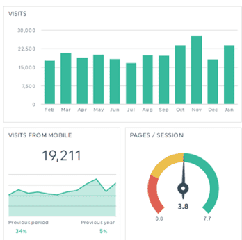
Here’s the stats from a local Irish SME that runs a consumer eCommerce website – you can see that about 88% of visitors are coming from mobile devices.
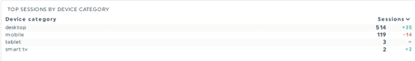
On the other hand, here’s stats on a sample month of visitors to the website of an Irish B2B client operating in a highly niche manufacturing sector, albeit with a radically higher turnover than the client above. Big diff in terms of the number of visitors but also the profile of devices used by site visitors – with 80% using desktops.
So, it shouldn’t always be mobile first but here’s a few thoughts;
- The stats are all there in Google for ye, so if you are starting on the process of designing a new site, check out what devices are being used to by your own site visitors. This will help you ID which version of the site you should spend the most time on in the design process. To access device-specific data, open Google Analytics and navigate to the “Report” tab, select “Overview”, and explore data on desktop, mobile, and tablet users. Analysing this information helps prioritise testing efforts, understand user preferences, and optimise the user experience accordingly.
- As mobile use continues to grow, you’ll need to make sure your site design does work across all the main device types. But focus on current devices; there are so many old versions of different devices out there; there’s bound to be some issues, for some users; don’t sweat the small stuff!
- Also, remember that a good user experience in navigating your site is a factor taken into consideration by Google in terms of being found in the search results. Many people don’t realise that mobile rankings are actually different than PC rankings – ideally, you’ll want to be performing well for both. See Core Web Vitals
Effective Web Design Considerations
So, what’s the difference between the design approaches for each device type?
Mobile Design:
First up you can tap your smartphone screen, so a mobile version of a news website, for example, will display a simplified homepage with easily tappable headlines and images. Scrolling is smooth, and navigation is accessible through a sticky top bar (always visible even as you scroll down the content – see www.healthmatters.ie as an example of this, on a mobile). The site’s content is organised in a vertical flow, allowing users to consume information effortlessly.
PC Design:
This is great if you want to showcase visuals as the desktop can easily display large, high-resolution images and immersive parallax effects. The navigation menu is visible across the top, offering a comprehensive view of services and projects. A site can use hover effects for PC design, because the mouse is being used to navigate the site. Check out how the Project images make a big impact on PC for this client site for example www.mmp.ie
Responsive Design:
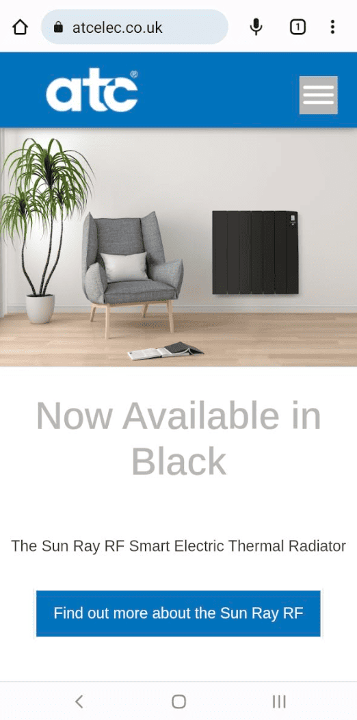
Inspiration designs websites in a responsive manner because this allows the site to automatically re-configure depending on the device. On mobile, products are presented in a single column with vertical swipe navigation, while on desktop, products are displayed in a grid layout with hover effects for additional impact or information. See www.atcelec.co.uk across the different devices and you’ll see how it is quite different for each one – but there was one design process.
Here’s the Googley Science Bit
Core Web Vitals
Core Web Vitals are metrics used by Google to assess the User Experience. The three main vitals are
- The time it takes for the main content to load (largest contentful paint – LPT – I know; don’t blame us for the terminology!)
- The time it takes to respond to a user interaction e.g. generate a page they have clicked on (first input delay – FID)
- The visual stability of the site when loading (cumulative layout shift – CLS)
Google uses these measurements as part of their assessment of how to rank your site. A good web agency (and ye might try Inspiration – just sayin’) will not only make sure the design accommodates a good user experience, but they will make sure the technical implementation of that design takes these considerations into account. And performance can vary according to the device used so this testing needs to be across devices.
Hamburger Menus – but not as you knew them!
Have you noticed the way many websites on mobile phones now use three bars – a hamburger – as a Menu bar? What do you think of them – not so delic. as the food right ???? ? They have also crept into the design of some sites on PCs, where a “mobile-first” design approach has been taken. There’s some pro’s and cons.
- Hamburger Menus: these iconic three-line menus reveal navigation links when clicked. While they save screen space, they may hide essential options, leading to lower discoverability and engagement. But they can keep the visual impact of the site “clean” at first impact, allowing for good branding or strong visuals – here’s a sample
- Topline Navigation: Traditional menus that display links directly on the page. They offer a comprehensive view of website content but may clutter the layout. Some of our clients like to use a combination; a fixed menu and a hamburger.

There’s no definitive answer to the hamburger choice; it’ll depend on what you think will work best for your audience and your site objectives.
There are some definite “best practice” considerations though for mobile design and here’s where we’ve rounded up the 8 that we think are most important.
8 Top Tips for Mobile-First Design
- Develop a Responsive Layout: Adopt a responsive design that scales and adapts to different screen sizes, ensuring a consistent user experience across devices.
- Optimise Website Speed: Improve loading times to make a positive first impression on users. Use tools like https://tools.pingdom.com/ to analyse loading times for both desktop and mobile versions.
- Compress Images: Reduce image file sizes by compressing them to enhance website speed. Consider using formats like JPEG 2000, JPEG XR, AVIF, and WebP for smaller file sizes.
- Avoid Pop-Ups: Skip pop-ups on mobile versions as they can be difficult to view and close on smaller screens.
- Optimise Button Size and Placement: Ensure buttons are large enough for easy tapping with thumbs and place them toward the bottom of the page for convenient navigation.
- Choose a Large and Readable Font: Opt for a font size that is legible on mobile screens, testing it on different devices to ensure readability.
- Declutter Web Design: Keep the design simple, organized, and clutter-free by removing outdated content and using white space effectively.
- Regularly Test on Mobile Devices: Continuously test your website on various mobile devices, including Android and iOS, to ensure a seamless mobile experience and to identify areas for improvement.
Is Inspiration the best option to help you sort your web design project? To borrow a phrase – probably!
Cathy
www.inspiration.ie/contact