We recently wrote about how every element of a website’s design plays a crucial role in capturing and retaining visitors. Today, we are going to elaborate on one of the most often underestimated aspects of design – colour.
What is Colour Psychology?
Colour psychology, the study of how colours affect human behaviour and emotions, is a powerful tool that you can leverage to create engaging and effective websites. Colour can have a huge impact on how your brand is perceived, with one study finding that customers’ perception of the taste of coffee was influenced by the design of its packaging. By understanding the psychological impact of colours and strategically implementing them in web design, you can evoke real emotion, enhancing brand identity, and improving the user experience.
The Psychology of Colours
Different colours can evoke specific feelings, associations, and cultural interpretations. Here are a few examples of how colours are commonly perceived:
Red – Associated with energy, passion, urgency, and even appetite stimulation. Brands like Coca-Cola and Netflix use red to grab attention and create a sense of excitement. Its often associated with FMCG and that’s why supermarkets like Spar also use it.
Blue – Symbolises trust, security, and professionalism. Tech giants like Facebook, Twitter, LinkedIn use shades of blue to establish credibility and a sense of reliability. Blue is also heavily associated with business and B2B markets. When local business and long-standing client Meritec set up an AV business over 25 years ago, blue was the only colour worth considering for B2B branding – though this is changing now.
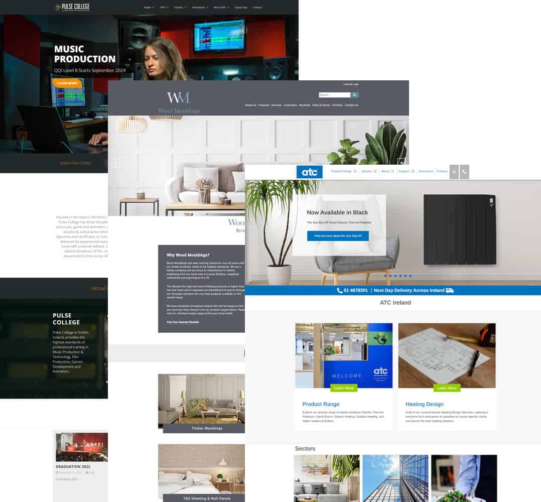
Green – Evokes feelings of growth, health, and nature. Companies like Starbucks and Whole Foods leverage green to communicate their eco-friendly and fresh image. Also used by political parties! A combination of green and blue is good to evoke trust and health – a client of ours, Health Matters does this well.
Yellow – Represents optimism, warmth, and creativity. Brands like McDonald’s and IKEA use it in their branding and promotions to create a sense of happiness and playfulness.
Black – Conveys sophistication, luxury, and elegance. High-end brands like Chanel and Apple often incorporate black into their branding to communicate exclusivity. Black conveys certainty and trust. Inspiration designed this logo for a beauty brand using black, for this reason https://stralabeauty.com/
Purple – Signifies creativity, spirituality, and luxury. Cadbury and Hallmark use purple to evoke a sense of indulgence and imagination. There’s tones of purple in the Small Firms Association logo reflecting the creativity of entrepreneurs (though I’m not sure luxury is appropriate or true for small business owners!)
These are just a few examples of colour associations, and of course the perception of colours varies based on cultural factors and individual preference. But its definitely worth bearing in mind that your colour choices – for your brand and website – should take into account the emotion you want to ignite and the likely colour preferences of your target audience.
Applying Colour Psychology in Web Design
In terms of web design specifically, besides the psychological considerations outlined above, we also need to consider what works best online, the brand identity and we need to work with a colour palette that looks aesthetically pleasing.
Here’s some considerations in website design:
Consistent Branding
Colours are a crucial component of brand identity. Select colours that align with the brand’s personality and values. Consistency across all touchpoints fosters brand recognition and trust. At a simple level; use the brand colours within the template of the site and consistently across all pages.
Visual Hierarchy
Strategic use of colour can guide users’ attention to important elements on the website, such as calls-to-action (CTAs) and key messages. Bright and contrasting colours can draw attention, while muted tones can create a calming effect.
Emotional Resonance
Choose colours that evoke the desired emotions in your audience. For instance, a wellness brand aiming to convey serenity might use calming shades of blue and green.
Cultural Considerations
Different cultures associate colours with varying meanings. Understand the cultural context of your target audience to avoid unintended misunderstandings or negative associations. Here in the west, red can evoke danger, love, and excitement, while in China it has ties to happiness and luck. In Indonesia, green is considered a forbidden colour, while Mexicans see it as the national colour – evoking pride and patriotism (as do the Irish!)
Readability
While aesthetics are important, readability is paramount. Ensure that text contrasts well with the background colour to make content easy to read. Harvard University recommends a contrast between text and background at a ratio of 4.5:1. There are tools available to help you check the ratio, before you commit to a design. A pet hate of ours is paragraphs of small white text on an image – impossible to read yet favoured by many for some reason! In terms of legibility – the easiest thing to read is black text on white. The reverse can have high impact for headings – but not for lines of text.
Colour Psychology in Branding
Several renowned brands have harnessed colour psychology to create strong and memorable brand identities. Here are a few examples:
Apple
Apple’s clean and minimalist design aesthetic is reinforced by its use of white and black. The white background on its website and in its product design conveys simplicity, innovation, and sophistication.
McDonald’s
The bright red and yellow colour combination of McDonald’s is designed to stimulate appetite and create a sense of excitement. These colours are prevalent in their branding, packaging, and restaurant decor.
Facebook’s use of blue is tied to trust and reliability. The colour blue also aligns with the idea of connecting people and building relationships, which is central to the platform’s purpose.
Amazon
Amazon’s strategic use of orange in its “Add to Cart” button draws attention and encourages action. Orange is associated with enthusiasm and determination.
Google’s use of a colourful logo reflects its playful and creative approach. Each colour in the logo communicates diversity and the wide range of services Google offers.
The Importance of Connecting with Customers
Colour psychology is a valuable tool to keep in your arsenal, enabling you to create a website that not only look visually appealing but also evokes the desired emotions and drives user action. Just as a painter selects colours for their canvas with intention, you should select colours for your website with purpose, creating the right blend of aesthetics, usability and psychology.
Feeling blue about your website? Contact Inspiration Digital Marketing today and you’ll be tickled pink!